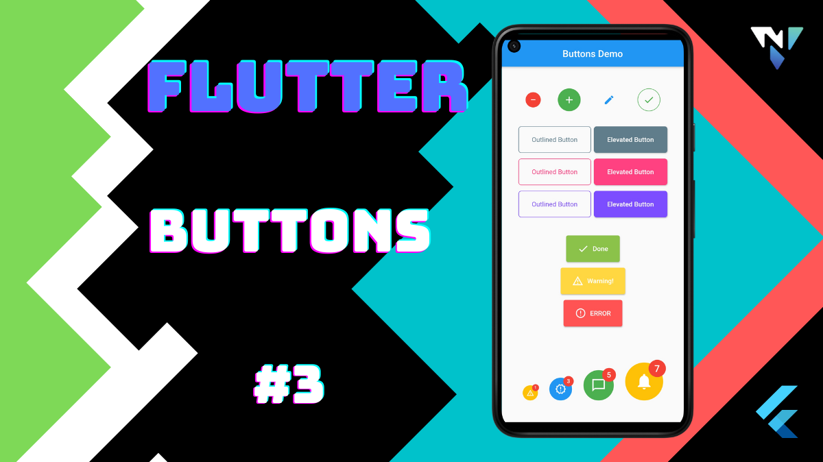

Tutorial and code of Buttons in Flutter. Copy and paste the below code as per your requirements.
import 'package:flutter/material.dart';
void main() => runApp(const MyApp());
class MyApp extends StatelessWidget {
  const MyApp({Key key}) : super(key: key);
  @override
  Widget build(BuildContext context) {
    return const MaterialApp(
      debugShowCheckedModeBanner: false,
      home: MyStatelessWidget(),
    );
  }
}
class MyStatelessWidget extends StatelessWidget {
  const MyStatelessWidget({Key key}) : super(key: key);
  @override
  Widget build(BuildContext context) {
    return Scaffold(
      appBar: AppBar(
        title:  Center(child: Text('Buttons Demo'),),
      ),
      body: Padding(
        padding: const EdgeInsets.symmetric(horizontal: 32),
        child: Column(
          mainAxisAlignment: MainAxisAlignment.center,
          children: [
            Row(
              mainAxisAlignment: MainAxisAlignment.spaceAround,
              children: [
                SimpleCircularIconButton(
                  iconData: Icons.remove,
                  fillColor: Colors.red,
                  iconColor: Colors.white,
                  radius: 32,
                  onPressed: () {},
                ),
                SimpleCircularIconButton(
                  iconData: Icons.add,
                  fillColor: Colors.green,
                  iconColor: Colors.white,
                  radius: 48,
                  onPressed: () {},
                ),
                SimpleCircularIconButton(
                  iconData: Icons.edit,
                  onPressed: () {},
                ),
                SimpleCircularIconButton(
                  iconData: Icons.check,
                  iconColor: Colors.green,
                  outlineColor: Colors.green,
                  onPressed: () {},
                )
              ],
            ),
            const SizedBox(height: 32),
            Row(
              mainAxisAlignment: MainAxisAlignment.spaceAround,
              children: [
                SimpleOutlinedButton(
                  child: const Text("Outlined Button"),
                  onPressed: () {},
                  outlineColor: Colors.blueGrey,
                ),
                SimpleElevatedButton(
                  child: const Text("Elevated Button"),
                  color: Colors.blueGrey,
                  onPressed: () {},
                ),
              ],
            ),
            const SizedBox(height: 12),
            Row(
              mainAxisAlignment: MainAxisAlignment.spaceAround,
              children: [
                SimpleOutlinedButton(
                  child: const Text("Outlined Button"),
                  onPressed: () {},
                  outlineColor: Colors.pinkAccent,
                ),
                SimpleElevatedButton(
                  child: const Text("Elevated Button",),
                  color: Colors.pinkAccent,
                  onPressed: () {},
                ),
              ],
            ),
            const SizedBox(height: 12),
            Row(
              mainAxisAlignment: MainAxisAlignment.spaceAround,
              children: [
                SimpleOutlinedButton(
                  child: const Text("Outlined Button"),
                  onPressed: () {},
                  outlineColor: Colors.deepPurpleAccent,
                ),
                SimpleElevatedButton(
                  child: const Text("Elevated Button"),
                  color: Colors.deepPurpleAccent,
                  onPressed: () {},
                ),
              ],
            ),
            const SizedBox(height: 32),
            const SizedBox(height: 6),
            Column(
              children: [
                SimpleElevatedButtonWithIcon(
                  label: const Text("Done"),
                  iconData: Icons.check,
                  color: Colors.lightGreen,
                  onPressed: () {},
                ),
                const SizedBox(height: 12),
                SimpleElevatedButtonWithIcon(
                  label: const Text("Warning!"),
                  iconData: Icons.warning_amber_outlined,
                  color: Colors.amberAccent,
                  onPressed: () {},
                ),
                const SizedBox(height: 12),
                SimpleElevatedButtonWithIcon(
                  label: const Text("ERROR"),
                  iconData: Icons.error_outline,
                  color: Colors.redAccent,
                  onPressed: () {},
                ),
              ],
            ),
            const SizedBox(height: 32),
            const SizedBox(height: 6),
            const SizedBox(height: 32),
            const SizedBox(height: 6),
            Row(
              mainAxisAlignment: MainAxisAlignment.spaceAround,
              crossAxisAlignment: CrossAxisAlignment.end,
              children: [
                SimpleCircularIconButton(
                  iconData: Icons.warning_amber_outlined,
                  fillColor: Colors.amber,
                  iconColor: Colors.white,
                  onPressed: () {},
                  radius: 32,
                  notificationCount: 1,
                ),
                SimpleCircularIconButton(
                  iconData: Icons.new_releases_outlined,
                  fillColor: Colors.blue,
                  iconColor: Colors.white,
                  onPressed: () {},
                  notificationCount: 3,
                ),
                SimpleCircularIconButton(
                  iconData: Icons.messenger_outline_sharp,
                  fillColor: Colors.green,
                  iconColor: Colors.white,
                  onPressed: () {},
                  radius: 64,
                  notificationCount: 5,
                ),
                SimpleCircularIconButton(
                  iconData: Icons.notifications,
                  fillColor: Colors.amber,
                  iconColor: Colors.white,
                  onPressed: () {},
                  radius: 80,
                  notificationCount: 7,
                ),
              ],
            ),
          ],
        ),
      ),
    );
  }
}
class SimpleElevatedButton extends StatelessWidget {
  const SimpleElevatedButton(
      {this.child,
        this.color,
        this.onPressed,
        this.borderRadius = 6,
        this.padding = const EdgeInsets.symmetric(horizontal: 28, vertical: 20),
        Key key})
      : super(key: key);
  final Color color;
  final Widget child;
  final Function onPressed;
  final double borderRadius;
  final EdgeInsetsGeometry padding;

  @override
  Widget build(BuildContext context) {
    ThemeData currentTheme = Theme.of(context);
    return ElevatedButton(
      child: child,
      style: ElevatedButton.styleFrom(
        padding: padding,
        primary: color ?? currentTheme.primaryColor,
        shape: RoundedRectangleBorder(
          borderRadius: BorderRadius.circular(borderRadius),
        ),
      ),
      onPressed: onPressed as void Function(),
    );
  }
}

class SimpleOutlinedButton extends StatelessWidget {
  const SimpleOutlinedButton(
      {this.child,
        this.textColor,
        this.outlineColor,
        this.onPressed,
        this.borderRadius = 6,
        this.padding = const EdgeInsets.symmetric(horizontal: 28, vertical: 20),
        Key key})
      : super(key: key);
  final Widget child;
  final Function onPressed;
  final double borderRadius;
  final Color outlineColor;
  final Color textColor;
  final EdgeInsetsGeometry padding;

  @override
  Widget build(BuildContext context) {
    ThemeData currentTheme = Theme.of(context);
    return OutlinedButton(
      style: OutlinedButton.styleFrom(
        padding: padding,
        textStyle: TextStyle(color: currentTheme.primaryColor),
        side: BorderSide(color: outlineColor ?? currentTheme.primaryColor),
        shape: RoundedRectangleBorder(
          borderRadius: BorderRadius.circular(borderRadius),
        ),
        primary: textColor ?? outlineColor ?? currentTheme.primaryColor,
      ),
      onPressed: onPressed as void Function(),
      child: child,
    );
  }
}

class SimpleElevatedButtonWithIcon extends StatelessWidget {
  const SimpleElevatedButtonWithIcon(
      { this.label,
        this.color,
        this.iconData,
        this.onPressed,
        this.padding = const EdgeInsets.symmetric(horizontal: 24, vertical: 16),
        Key key})
      : super(key: key);
  final Widget label;
  final Color color;
  final IconData iconData;
  final Function onPressed;
  final EdgeInsetsGeometry padding;

  @override
  Widget build(BuildContext context) {
    return ElevatedButton.icon(
      onPressed: onPressed as void Function(),
      icon: Icon(iconData),
      label: label,
      style: ElevatedButton.styleFrom(primary: color, padding: padding),
    );
  }
}

class SimpleCircularIconButton extends StatelessWidget {
  const SimpleCircularIconButton(
      {this.fillColor = Colors.transparent,
        this.iconData,
        this.iconColor = Colors.blue,
        this.outlineColor = Colors.transparent,
        this.notificationFillColor = Colors.red,
        this.notificationCount,
        this.onPressed,
        this.radius = 48.0,
        Key key})
      : super(key: key);

  final IconData iconData;
  final Color fillColor;
  final Color outlineColor;
  final Color iconColor;
  final Color notificationFillColor;
  final int notificationCount;
  final Function onPressed;
  final double radius;

  @override
  Widget build(BuildContext context) {
    return Stack(
      clipBehavior: Clip.none,
      children: [
        Ink(
          width: radius,
          height: radius,
          decoration: ShapeDecoration(
            color: fillColor,
            shape: CircleBorder(side: BorderSide(color: outlineColor)),
          ),
          child: IconButton(
            padding: EdgeInsets.zero,
            splashRadius: radius / 2,
            iconSize: radius / 2,
            icon: Icon(iconData, color: iconColor),
            splashColor: iconColor.withOpacity(.4),
            onPressed: onPressed as void Function(),
          ),
        ),
        if (notificationCount != null) ...[
          Positioned(
            top: radius / -14,
            right: radius / -14,
            child: Container(
              width: radius / 2.2,
              height: radius / 2.2,
              decoration: ShapeDecoration(
                color: notificationFillColor,
                shape: const CircleBorder(),
              ),
              child: Center(
                child: Text(
                  notificationCount.toString(),
                  style: TextStyle(
                    color: Colors.white,
                    fontSize: radius / 4,
                    fontWeight: FontWeight.w600,
                  ),
                ),
              ),
            ),
          ),
        ],
      ],
    );
  }
}